This is a time of great uncertainty – and this is just one more layer of I don’t know and I can’t predict. So, caution to the wind, full transparency, 100% authentic sharing – I’m taking you all with me as I learn about self-publishing!
I’ve published traditionally, been published by an Indie publisher and self-published before the “new” e-book craze. (LOL.) Despite my multiple experiences, this is all new, and that just goes to show you how quickly this industry is changing.
And I’m going to share the entire publishing process with all of you. The schedule is firming up, and the launch date is still TBD, but for now, I ‘ll share my thoughts and process on designing and choosing book covers!
The book is entitled:
Write Without the Fight – Decode Your Creativity and Write… words (I haven’t decided on final copy yet)
On to to the next step…
Book Cover Designs and Trends!
I’m designing my book cover – and I KNOW (!) I should hire a professional. I’m a DIY type of gal, and my husband has photoshop, so I’m at least giving it a go. The general wisdom is you should hire a professional book cover designer, 1) bec you need professional level design, and 2) bec you need someone who keeps up on book cover trends
If you want to hire a professional for your self-published book, you can find fiverr.com and/or 99designs.com
Trends are Very Important
First things first – research. What are the current book cover trends? You want your book to stand out AND fit in. It should fit on the virtual shelf (Amazon) and be the one among the options that your reader will gladly choose.
Amazon Research for Similar Book Covers
I went to Amazon and searched many of my keywords: creative process, writer’s block, how to write a book, and there, I saw this kind of cover.


Which of those books stand out to you? Which are you most likely to look closer at? There are other factors that persuade someone to buy a book – the author, number of reviews, the description, even the sub-title – but one challenge at a time? By looks alone, which appeals to you?
With the keywords creativity and creative process you get a little more whimsy:

- Non-fiction Trend: Chunky type
- Light Blue/green feels modern/trendy
Trend Research on Book Designs
Ahh… Google! It can deliver a mini-design degree in three articles! I looked at AIGA’s (American Institute of Graphic Arts) article on book cover trends and their national survey of designers for their favorite book cover of the year (2021). I also read the Penguin Random House blog of their covers and designers.
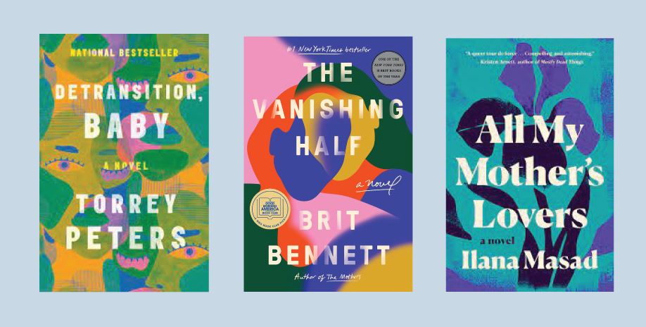
Here’s what I learned… If you’ve been to Target lately, you’ll have seen what is called the “Frappuccino-Unicorn trend.” This is very NOW. An indistinct moosh of colors that’s half floral, half facial and looks like a Starbucks frappucino. But notably, still chunky type.

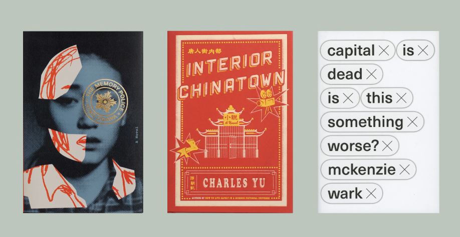
Publishers and designers are looking to create something that is Instagram-friendly and that will work as a thumbnail on Amazon. Here are a few covers noticed by AIGA for their originality and beauty. Wow, right?

That is way beyond my skill level… I’d like that book, but different, (said every author ever). And if I’m doing it, it’ll be VERY different.
- Fiction Takeaway – Illustrated
- Blues, greens, pink, color
- Still chunky type
Once you think you know it all, you still have to do the research, even if, in the end, all you do is brief your designer! Here’s what we came up with for my book covers. Let me know what you think!
Presenting My Book Cover Options
Chunky Type
Both are trendy colors, and the title is bold! What do you think about one of these two covers? Which color do you prefer? Do you like the “fighting” type?

Angles, Pinks and Greens, Whimsy
According to Penguin Random House – who knows their onions – books are trending toward pink and green, which presaged the “fruit salad” as some call it, or “frappucino unicorn” as we discussed above. So, off I go to experiment with pink and green. What do you think?

Bold, Single Image
This one hews to my normal branding – which is kind of a dirty word among authors. But my website and logo are black white and red. Do you like this one?

Please let me know in the FB Group what you like and why. Also, if you have questions about designing a book cover, give me a holler. I hope you’re game for all my hand-wringing, newbie research and generally sharing this process with you. Checklists, calendars and promotion plans will be forthcoming as they develop!